Prudential | Critical Mass
UI Design | Responsive Design | Branding | Rapid prototyping
Tools: Adobe Illustrator | Sketch | Invision

Context and goal
During the 12-month-long project, the Critical mass design team identified areas for improvement by taking steps towards enhancing the customer experience (CX), building a customer experience team (Critical mass designers and client stakeholders), and addressing technological challenges. The focus on CX governance, employee engagement, and better articulation of brand values and purpose contributed to a more successful and customer-centric approach within the organisation.
Role and Responsibilities
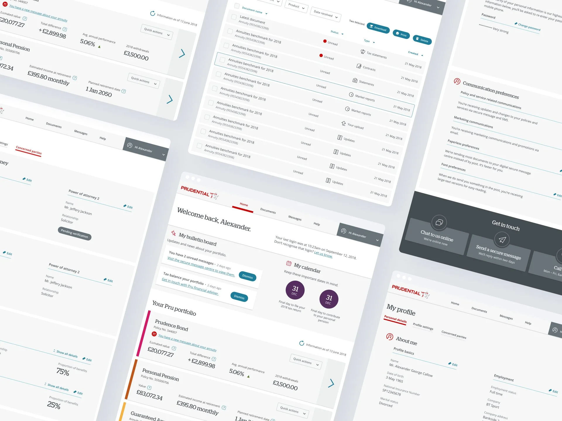
My role was primary a UI designer, which involved developing design libraries, design patterns, visual graphics, style guides. These design elements were carefully created to establish a cohesive, appealing, intuitive and consistent visual brand identity for the online portal. The design resources were later applied throughout the platform, ensuring a unified user experience and a seamless integration of the new design elements.
The organisation's core values revolve around customer-centricity, which means placing the customer at the centre of all decisions and actions. Keeping brand promises is a central tenet of the organisation's ethos, emphasising the importance of delivering on commitments made to customers.
Employee engagement is considered a crucial element of the organisational culture, recognising that motivated and engaged employees contribute to better customer experiences. The customer insights play a pivotal role in guiding all strategic decisions, ensuring that data-driven decisions align with customer needs and preferences.
Customer experience (CX) is maintained through various departments and teams to collaborate and deliver a unified and seamless customer experience. It is integrated into all aspects of the organisation's operations, emphasising that customer experience is not just a departmental responsibility but an integral consideration in every decision and practice across the organisation.
The ambition was realised by the CX team run by Critical Mass, effectively articulating and fulfilling promises and purpose to customers, staff, and partners, fostering strong relationships and trust among all stakeholders.
Development of the UI
The primary UI focus was to orchestrate a symphony of design elements that not only enhanced the portal's aesthetic appeal but also provided a framework for a seamless and immersive user journey. The creation and implementation of design libraries, patterns, and style guides played a pivotal role in transforming the brand's vision into a tangible, engaging reality for users to explore and enjoy.
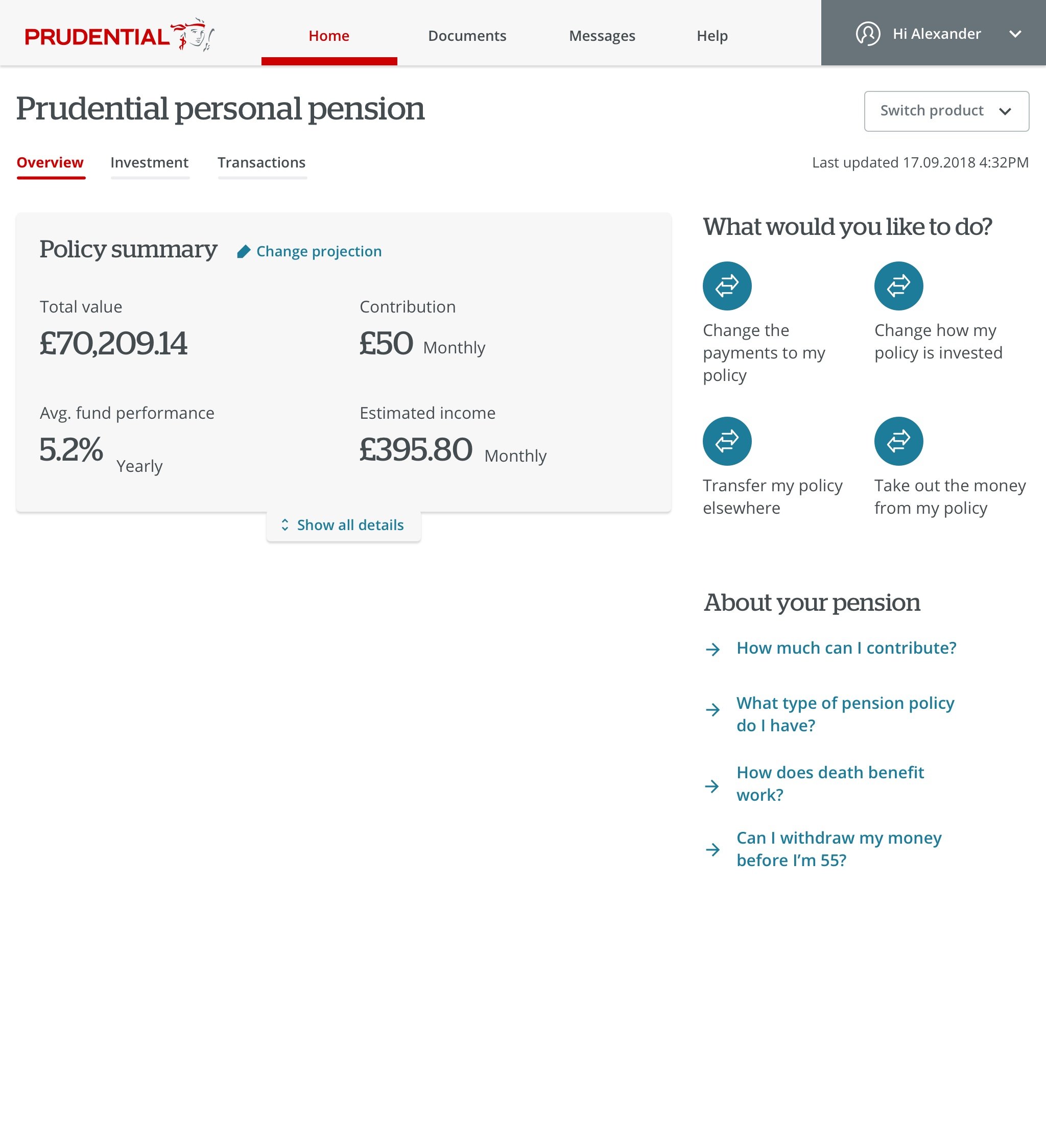
MyPru | Dashboard and My Profile
The MyPru designs seamlessly integrates a range of key elements, including new iconography, font hierarchy, layouts, functionality, and user-friendly features. This comprehensive approach ensures a visually cohesive, intuitive, and efficient user experience.


MyPru | Pensions

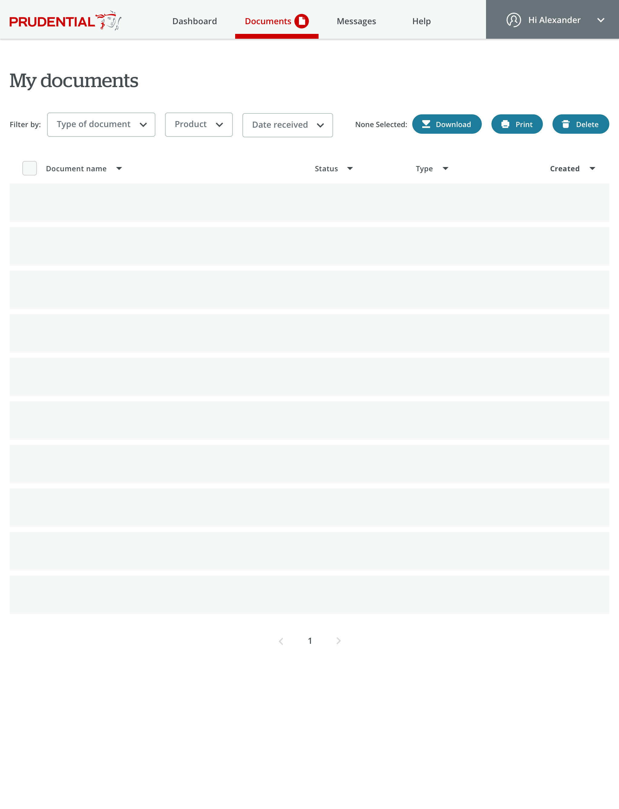
MyPru | Documents
The design of the MyPru dashboard for storing documents combines functionality and user-friendly aesthetics, offering a seamless experience for managing important files.


MyPru | Onboarding design
The onboarding process has been carefully designed from both a UI and UX standpoint to be succinct, straightforward, and efficient, featuring the newly applied icons. With a concise 4-step structure, users have the flexibility to skip any step if they prefer.


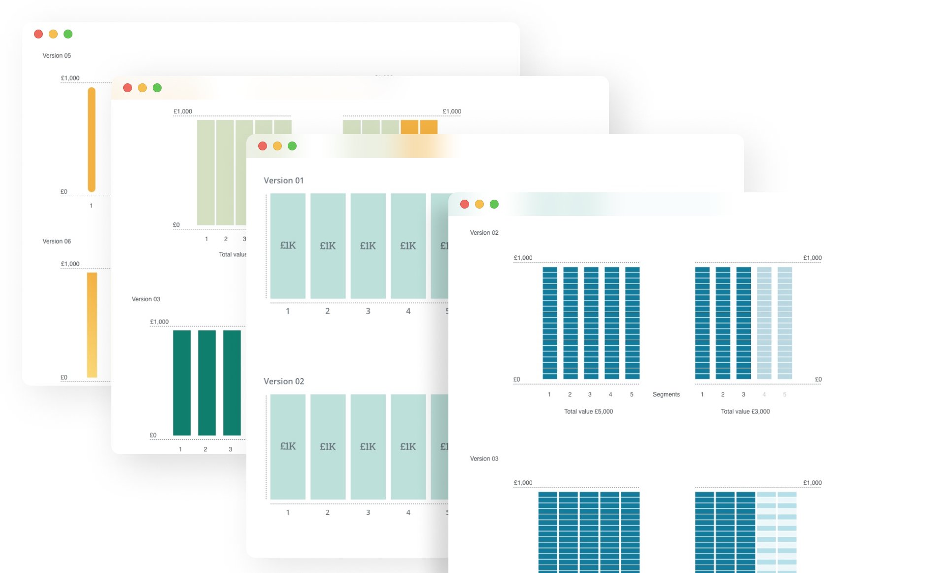
Data visualisation
Through careful design language and data visualisations we were able to break down the various aspects of bonds, such as interest rates, maturity dates, and underlying assets, into clear and coherent representations. The final concepts below:


Ideation process for the data visualisation concepts
Through these examples, my aim was to leverage data visualisation and craft effective colour schemes to enhance user understanding and engagement. Here are a few examples of my contributions:

Bond Composition Infographic: I took on the challenge of creating an infographic that visually dissected the intricate components of bonds. Through the strategic use of charts, graphs, and colour-coded segments, I translated complex data into an accessible and engaging visual format. The colour scheme was meticulously chosen to differentiate between various bond elements, guiding users through the composition with clarity.

Interest Rate Comparison Chart: Another aspect I tackled was presenting interest rates using a comparative chart. By employing a gradient colour scheme, I conveyed different interest rates with varying intensities of colour. This intuitive visualisation allowed users to quickly grasp the range of rates and make informed decisions.
Maturity Date Timeline: To elucidate the concept of maturity dates, I developed a timeline visualisation. By harmonising a cohesive colour palette with a logical timeline structure, I conveyed the progression of maturity dates across various bonds. This approach aimed to empower users to discern the temporal aspects of bonds effortlessly.

Risk vs. Return Matrix: Designing a risk-return matrix, I utilised a dynamic colour scheme to illustrate the varying degrees of risk and return associated with different bonds. This graphical representation was meant to guide users in assessing trade-offs between risk and potential rewards in a visually intuitive manner.