M&S Bank | RSA Insurance Group
UI Design | Responsive Design | Branding | Prototyping
Tools: Figma
The M&S Rebrand
“To enhance life every day by bringing M&S values to banking”
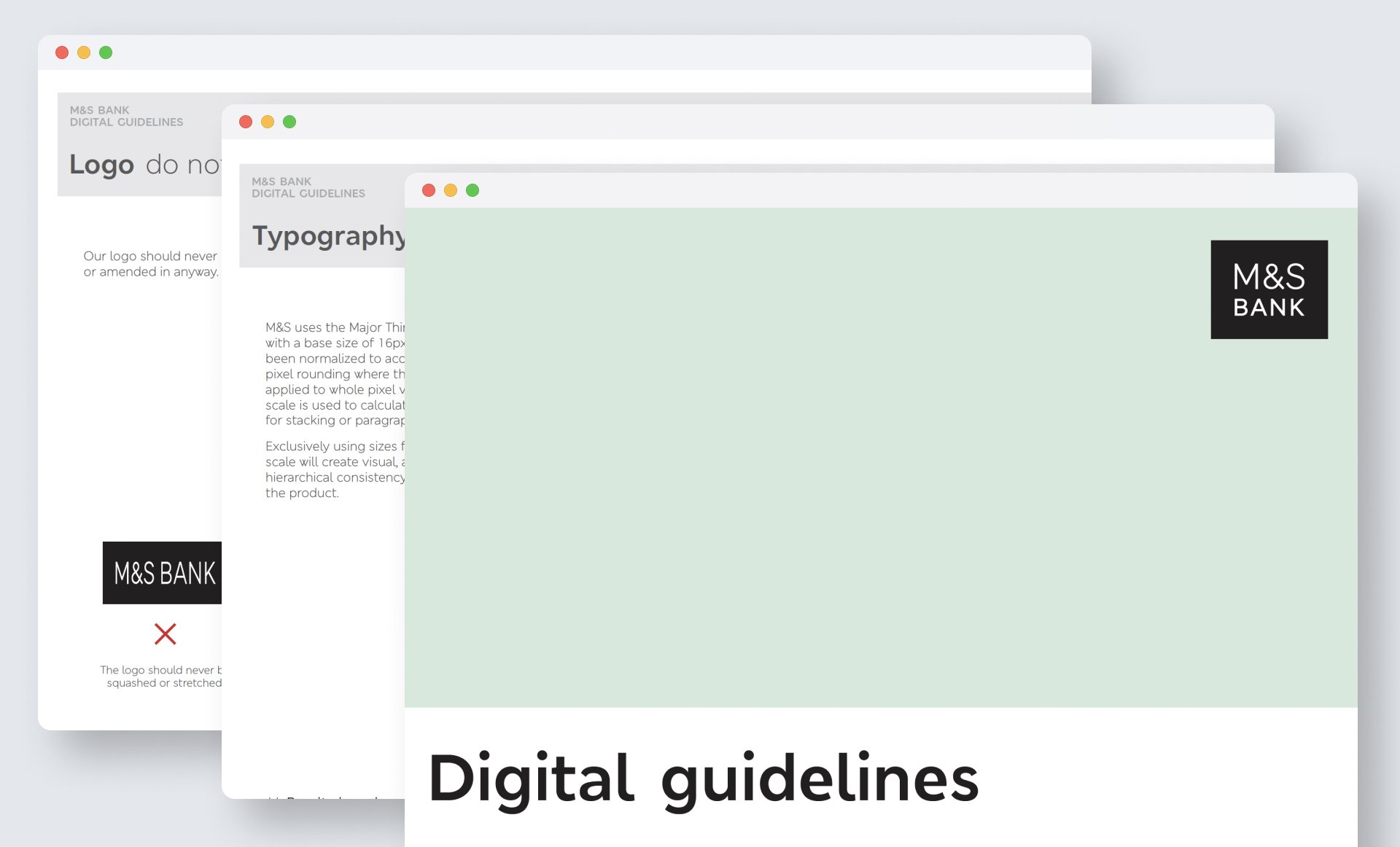
M&S Bank digital guidelines 2021
RSA design system and M&S Bank rebrand
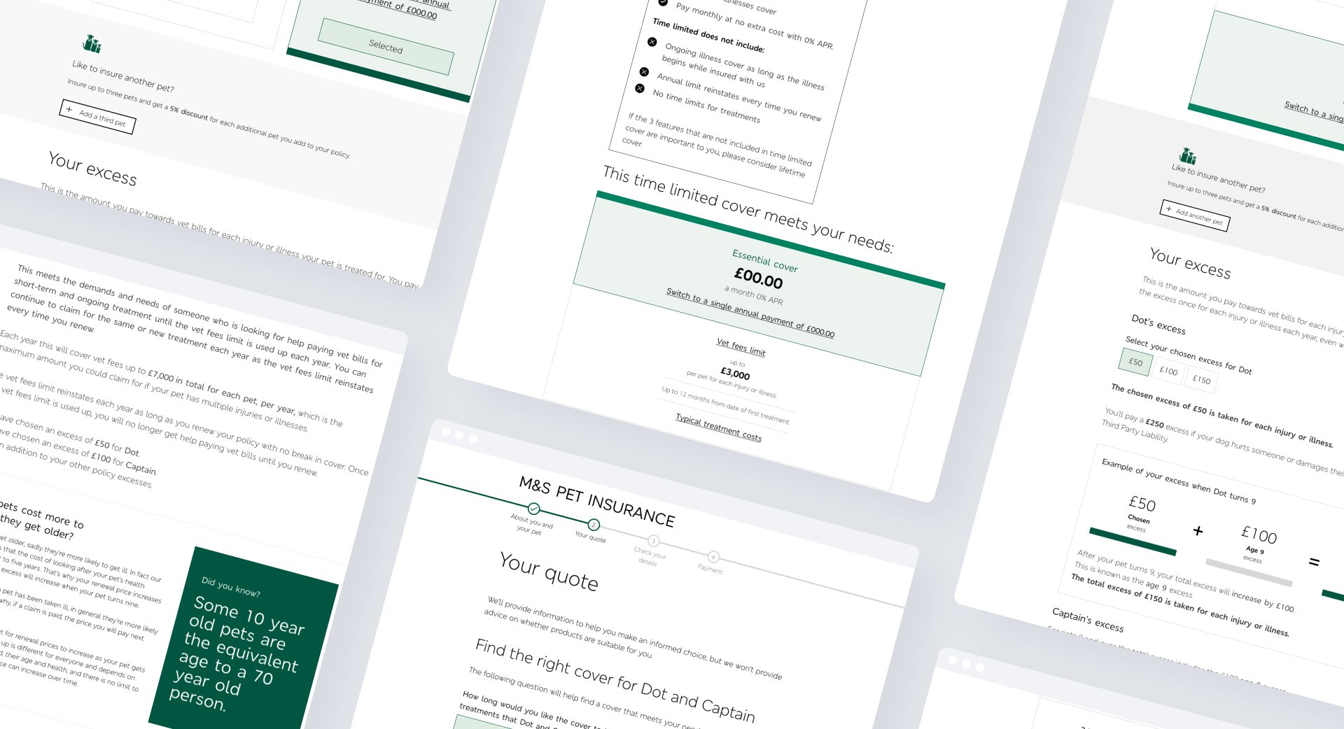
Amidst the project's timeline, our client was undergoing a transformative rebranding process. This transition encompassed the development of vital elements such as color palettes and iconography. My role was instrumental in navigating this intricate phase, collaborating closely with client stakeholders and the design lead to strike a harmonious equilibrium between introducing the upcoming rebrand and maintaining a cohesive visual identity.
My task entailed a delicate dance between the client's evolving brand and the project's immediate needs. By seamlessly weaving the yet-to-be-launched brand elements into our current design framework, I achieved a well-considered mid-point that honored both the client's future vision and the project's objectives.
This harmonisation was further extended to our design libraries, where I meticulously integrated the evolving brand guidelines. The result was a consistent and cohesive set of design resources that seamlessly blended with RSA components and page layouts. This approach ensured that the rebrand's essence was elegantly interwoven while retaining the project's functional and aesthetic integrity.
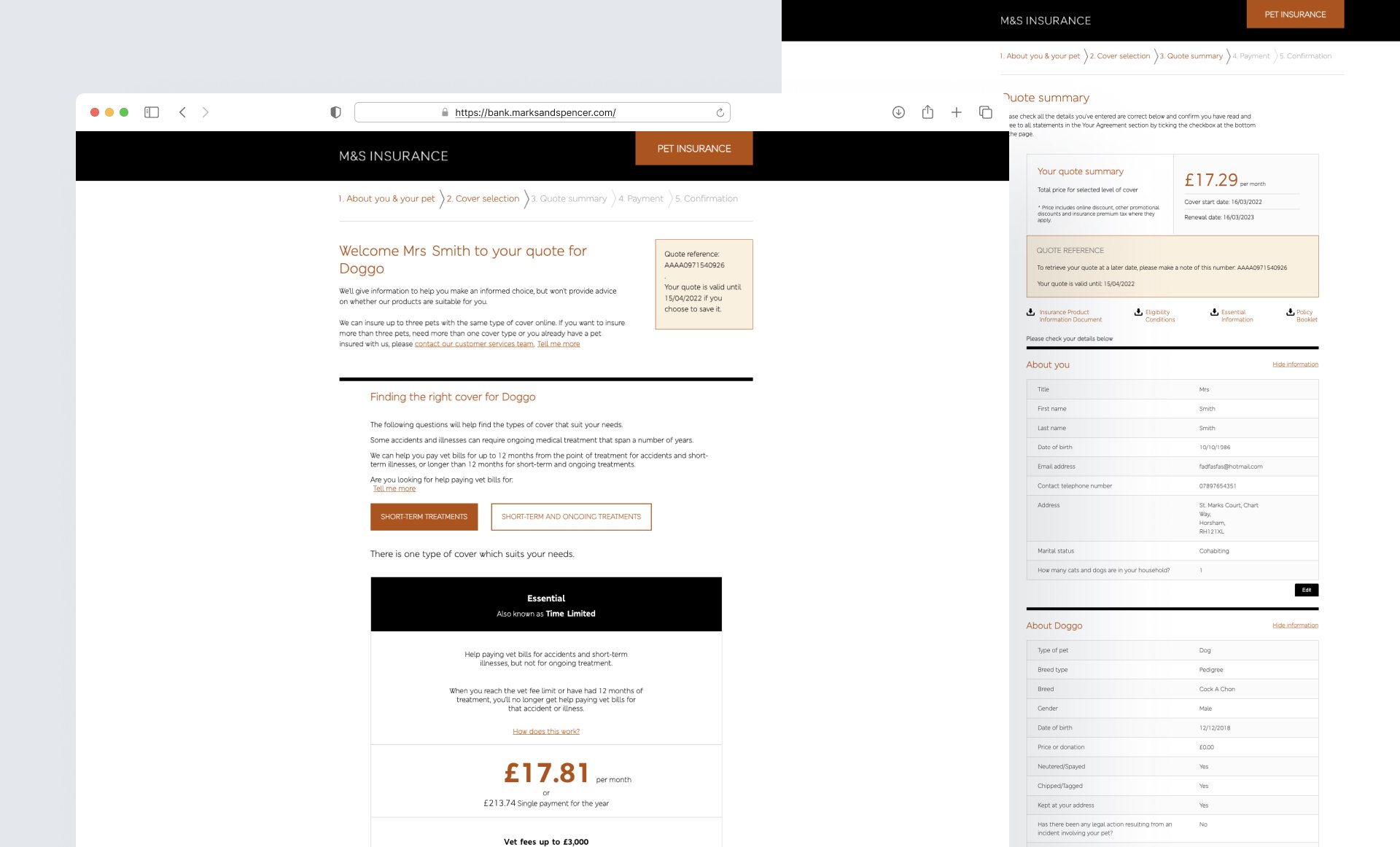
Old brand and product
New component design | Design system
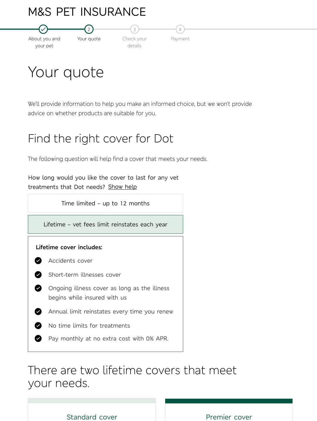
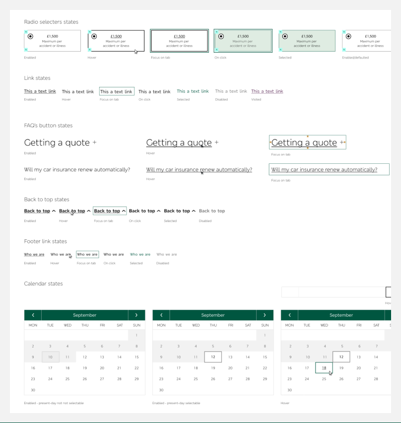
Innovation within the RSA design system led to the creation of a novel component. The task was to devise an engaging and concise solution for users to comprehend the functionality of selected product features. To achieve this, a multi-disciplinary design system working group was established, comprising UI, UX, and content designers, design system leads, and developers.
Two concurrent work streams were orchestrated: the first focused on designing the new component, ensuring it seamlessly fit the project's needs without impeding development or sprints. The second involved presenting the proposed component to the design system team, with the ultimate goal of integrating it across various other products, including home, motor, and claims.

New component design for Excesses

Table layout for product features
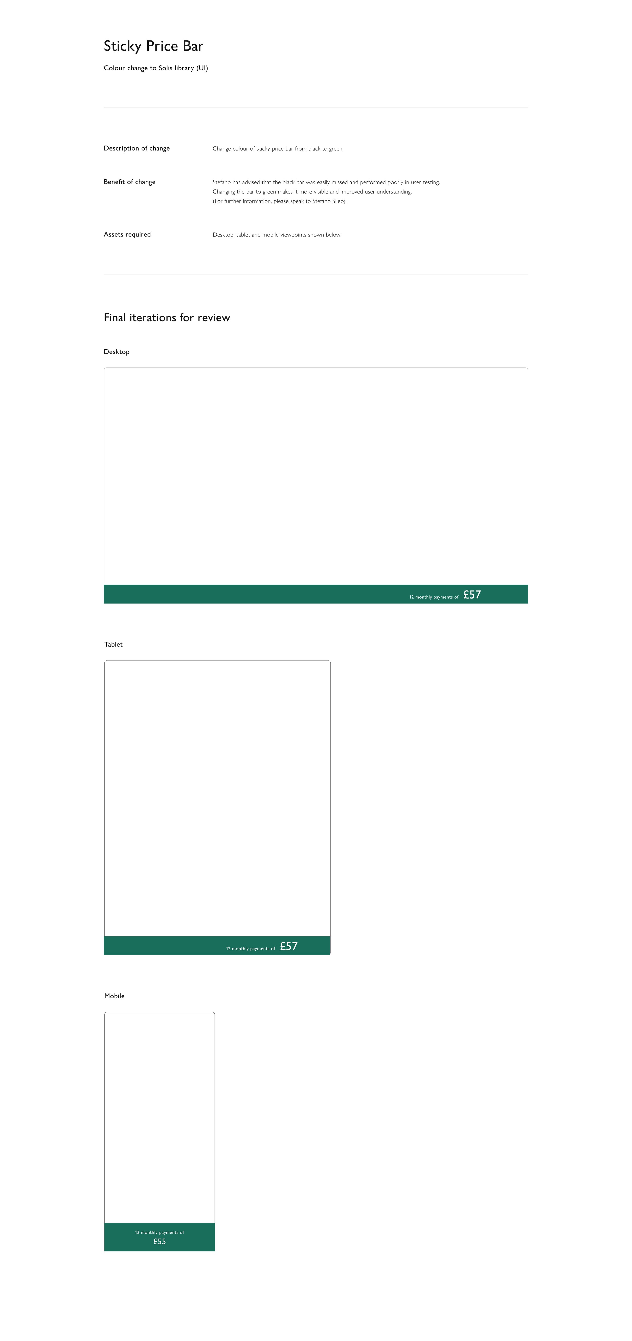
Sticky price bar
The outcome was an innovative component that effectively communicated product functionalities in an engaging manner. By harnessing the collaborative efforts of a diverse design system working group, the component not only met the project's objectives but also aligned seamlessly with the broader design system, enhancing its versatility and applicability.
This dynamic approach not only solved the immediate challenge of user comprehension but also exemplified the power of cross-functional collaboration and iterative design within the design system framework. Through this process, the new component emerged as a valuable addition, serving as a testament to the agility and effectiveness of the RSA design system.
Brand loyalty
Users have a strong affinity for the M&S brand and are familiar with its presence on the high street. This indicates high brand recognition and loyalty. Therefore, it was crucial to prioritise highlighting core M&S Bank branding and unique selling points (USPs) to ensure customer engagement.
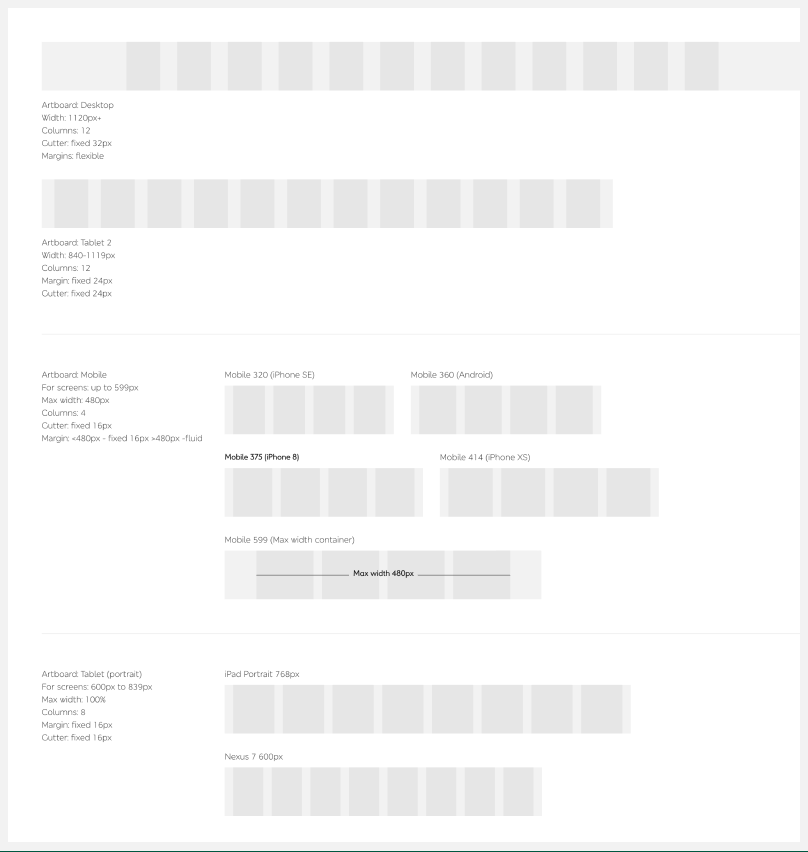
Grid system: Employing an 8-pixel grid design approach within the design system ensures precision and harmony across elements. This structured framework allows for meticulous alignment, enhancing usability and aesthetic appeal while facilitating seamless scalability across various platforms and devices. By adhering to the 8-pixel grid, design elements seamlessly interlock, resulting in a design the developer can easily understand.
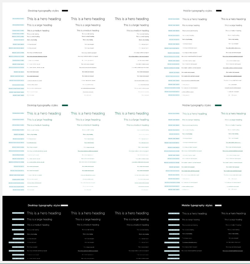
Typography scale: By adhering to the 8pt grid, typography achieves a cohesive and polished appearance, contributing to a seamless and aesthetically pleasing user experience.
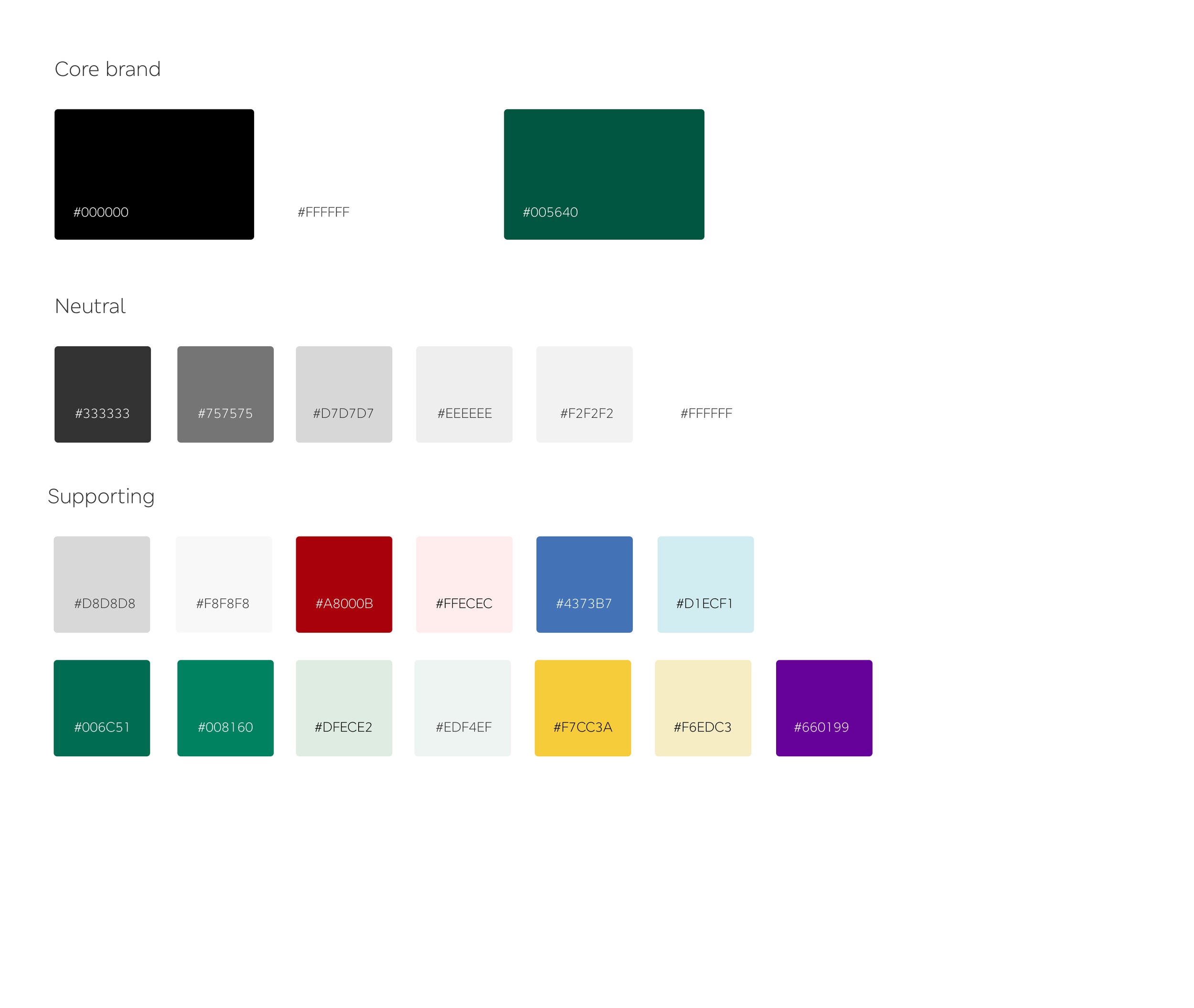
Colours: A distinctive fusion of M&S's current, upcoming, and RSA-approved accessible color palettes was artfully crafted. This exceptional blend harmoniously combined established brand hues, future shades, and the accessibility-focused colors endorsed by RSA.
Page layout and concepts
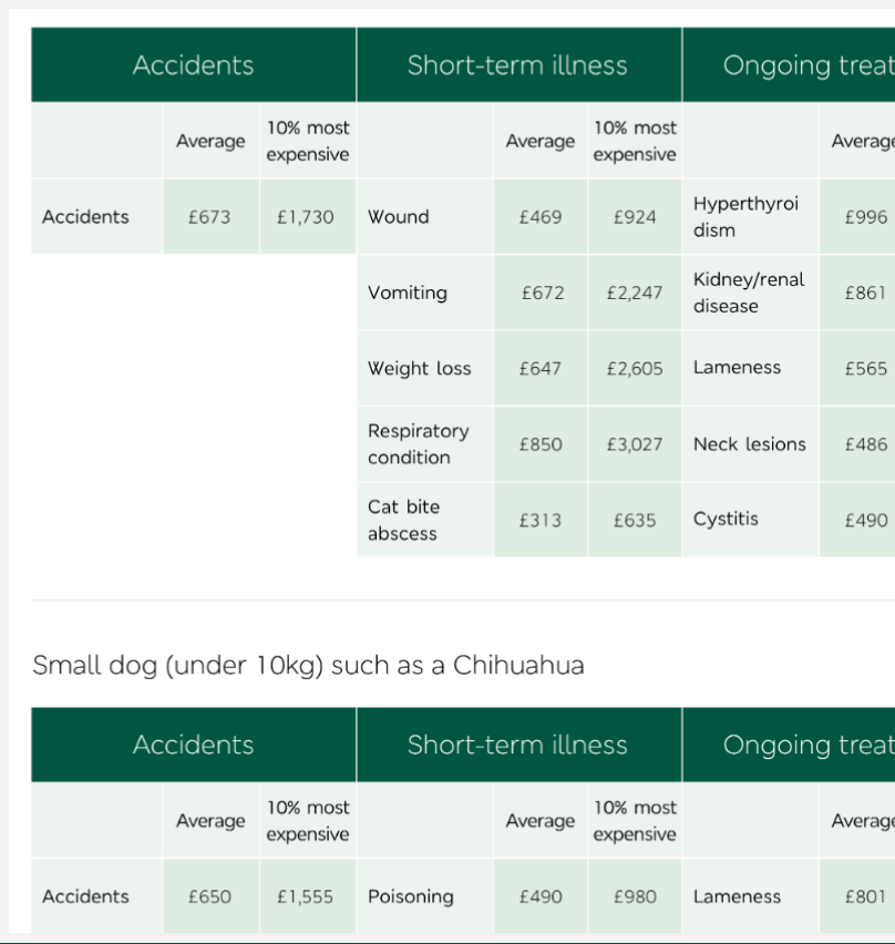
Through these examples, my aim was to leverage data visualisation and craft effective colour schemes to enhance user understanding and engagement. Here are a few examples of my contributions: