John Lewis | RSA Insurance Group
UI Design | Responsive Design | Branding | Prototyping
Tools: Figma
Context and goal
“Whatever it is, the way you tell your story online can make all the difference.”
John Lewis Design Lead
Context and goal
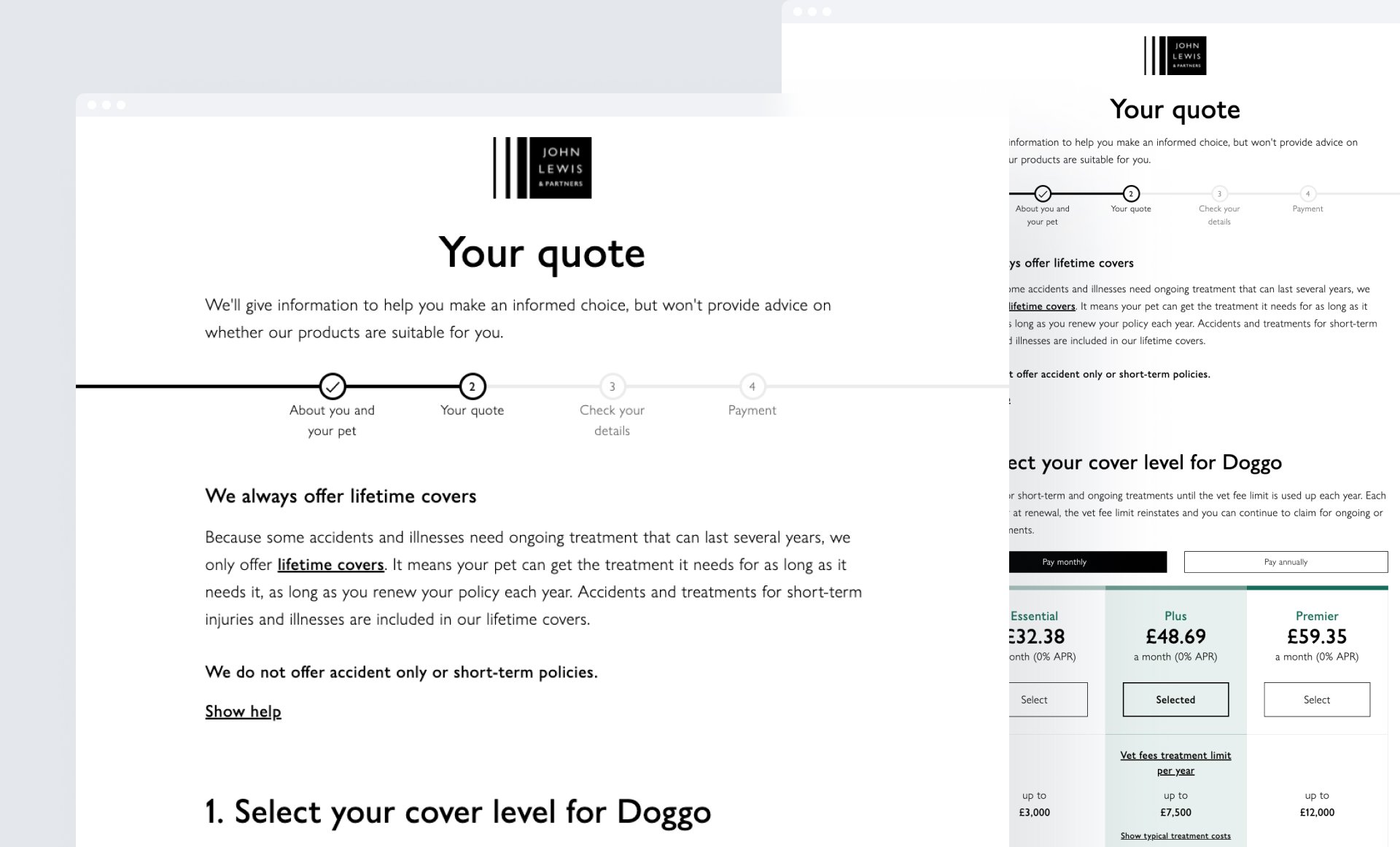
The objective of this project was to simplify the Pet Insurance quote and purchase journey for the John Lewis channel. The aim was to streamline the process of obtaining a quote, making it user-friendly and easy to understand. This involved enhancing the clarity of coverage details so that customers could readily comprehend the protection they were being offered. This endeavor led to the development of an intuitive online platform that provides customers with transparent and accessible information about various cover levels.
This initiative is an integral part of our operational plan, which is designed to implement strategic measures and efficient workflows, ensuring that the operational plan targets are not only met but exceeded. To achieve this, we have leveraged our proficiency in error management, replicating the successful error detection and resolution mechanism employed in the pet journey across other projects. This approach significantly enhances our ability to monitor and rectify errors and defects with precision and efficiency.
Moreover, our journey towards optimisation extends to enhancing the insights obtained from the current quote and purchase journey. By integrating Google Analytics (GA), we unlock a deeper understanding of customer behaviours, granting us comprehensive insights into their interactions with the journey. This data-driven understanding forms the bedrock for informed commercial discussions, particularly with regard to pricing and underwriting strategies. Through these strategic endeavours, we're committed to delivering a seamless and enriching experience for our customers in the John Lewis channel.
Role and Responsibilities
My role as the primary UI designer within the team, was to create design libraries, design patterns, user interactions, new components to update into the design system, style guides and page layouts. These elements were developed to establish a cohesive and consistent visual identity for the online quote and buy journey. By creating and implementing these design resources, I was able to ensure a unified user experience and maintain a consistent look and feel throughout the platform.
UX workshops
“The beauty of design lies in its iterative nature, enabling us to listen, learn, and adapt in pursuit of perfection.”
UX Designer - RSA
Challenges and hypothesis
The challenge was to address customer understanding of our product and what is covered within the tiers. Our focus is on simplifying insurance coverage information. We aim to make it easier for customers to comprehend exactly what they are covered for, enhancing their clarity and confidence.
Clear documentation of previous promotional code setups is paramount. We intend to ensure that customers encounter no confusion while utilising promotional codes during their transactions.
Our goal is to enhance awareness across our team regarding project interdependencies and their potential impacts. This heightened awareness will lead to more efficient project execution. John Lewis will have access to a unique product range featuring three tiers of premier offerings. This variety ensures tailored solutions for diverse customer needs. The plan to introduce strategic brand moments at crucial touchpoints, fostering a stronger connection between customers and our brand.
Our approach involves replicating existing live content while infusing new, relevant content. This mix will ensure that customers access comprehensive and up-to-date information. Adherence to regulations, including the Insurance Distribution Directive (IDD), is a fundamental commitment. We will ensure that our operations align meticulously with regulatory standards.
Our strategies encompass these critical aspects, ensuring an enriched experience for our customers while maintaining regulatory compliance and operational excellence.
UX workshops
The John Lewis Day 2 venture encapsulates a pursuit for perfection through refining the EVO release of 2021. This engagement is characterised by a meticulous focus on enhancing the details capture page and the quote summary, with an aim to introduce a new product, revolutionize excess offerings, and tailor the experience for each customer.
The crux of this endeavour revolved around achieving a harmonious union of intricate elements. The primary challenge was to amplify the user engagement and satisfaction through an elevated interface. This endeavor demanded careful attention to detail, seamlessly accommodating the requirements from various stakeholders, including Regulations, Underwriting, Product, and the esteemed John Lewis team.
The journey embraced a comprehensive exploration of the revised excess section, a pivotal step dictated by the insights from Regulations, Underwriting, Product, and John Lewis.
This phase was marked by an intensive testing regimen, allowing us to refine and shape our design in response to user behaviors and preferences.
Leveraging the power of Figma, we brought our vision to life through a high-fidelity clickable prototype. This intricate digital prototype served as the canvas for unmoderated user testing, providing an immersive experience for participants. To resonate with the diverse user base, we ensured that our prototype was optimised for mobile usage, recognising the prevalence of on-the-go interactions.
The John Lewis brand
RSA design system
The John Lewis brand had already been seamlessly integrated into the design system within RSA. This project represented a coherent progression, focusing on elevating the existing pet quote and purchase journey that was already in place.
New component ideation | Design system
Innovation within the RSA design system led to the creation of a novel component. The task was to devise an engaging and concise solution for users to comprehend the functionality of selected product features. To achieve this, a multi-disciplinary design system working group was established, comprising UI, UX, and content designers, design system leads, and developers.
Two concurrent work streams were orchestrated: the first focused on designing the new component, ensuring it seamlessly fit the project's needs without impeding development or sprints. The second involved presenting the proposed component to the design system team, with the ultimate goal of integrating it across various other products, including home, motor, and claims.
New component design for Co-payment.
This proposed new component received positive feedback from users during the user testing phase. The arrangement of an example alongside selector buttons effectively minimises cognitive load and enhances users' comprehension of the presented data.
In this section, we've transformed the title from "Choosing a co-payment contribution" to "Contributing towards Dot's vet bills" to provide clear guidance and context. This immediately informs users that they will be making contributions towards their pet's healthcare costs.
We've enriched the co-payment section with additional content that helps users understand when and why they need to make co-payments. This empowers users with the knowledge they need to confidently navigate their pet's healthcare journey.
To optimise the mobile experience and streamline the information, we've reduced the co-payment example to a single scenario. This simplification ensures that users can quickly grasp the concept without feeling overwhelmed by excessive figures.
The heading "When Dot turns 9 your excess will change" has been reimagined as "When Dot turns 9 your 10% contribution will change." This modification immediately informs users about the impending change to their contribution, providing them with clear expectations.
Excess equation new component
The client shared various alternatives for the grey color employed in the bars of the envisioned Excess Calculation Illustrations component.
The consensus was that the initial grey shade was too light. While the options presented are all darker than the original, our preference still leans toward a lighter hue.
This choice aims to prevent the grey from overpowering the green or yellow, ensuring that the bar doesn't seem 'filled' by grey.
It's important to note that a darker grey could heighten the risk of misperception, potentially causing confusion and counteracting the purpose of the component.
Information card
By refining the existing information card format, we introduced bulleted lists to facilitate easier information absorption for users. Initial testing indicated their clear advantage in enhancing readability and user comprehension.
Button with icon
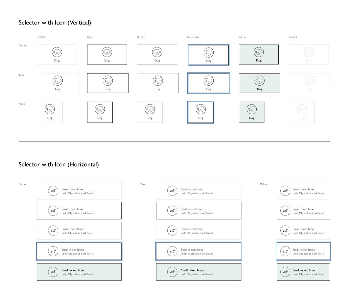
A design solution that seamlessly incorporates icons into selector buttons. Vertical and horizontal layouts ensure versatile application across RSA products and the design system, enhancing usability and maintaining a cohesive user experience.
Page layout and concepts
Through these examples, my aim was to layout and craft effective branding and componet to enhance user understanding and engagement. Here are a few examples of my contributions:
Challenges and outcomes
The design journey for the John Lewis Day 2 project ventured into a phase of user testing, revealing a profound narrative of growth and understanding. While the initial round of testing yielded results that fell short of expectations across both desktop and mobile platforms, these outcomes served as catalysts for a more refined and impactful design evolution.
In the spirit of collaboration, our recommendations are poised to be unveiled before the discerning eyes of the "pet tribe." This engagement was a testament to our commitment to crafting designs that align with user preferences and aspirations. By inviting feedback, the design team (UX/UI/Content designers) aimed not only to understand the landscape of potential adjustments but to also ensure that our designs resonate harmoniously with the needs of our users.
The journey toward design excellence is one of constant evolution and the design team anticipated the initiation of further moderated testing. This phase unfolded upon the culmination of UI design for the full journey, embodying our dedication to a holistic design approach. The resolve to address any identified ambers raised in prior testing remained unwavering, with our focus firmly set on achieving measurable improvements.
To ensure these improvements come to fruition, the methodology embraced the creation of targeted scenarios. This approach meticulously hones in on pain points, with a particular emphasis on the Co-payment aspect. By dissecting these challenges through scenario exploration, we cultivated solutions that breathe life into user interactions, ensuring that each touchpoint aligns seamlessly with user expectations.


